

Implementation references
An overview of implementation references.
Scripting API
Overview

Most Editor controls appear in default windows and can be docked in the main app window. Windows usually perform two principal functions:
- To render the interface elements and general content in the provided area and position
- To allow the user to generate mouse and keyboard events in the appropriate areas to control the interface
Index

Window types found in the editor:
Choosing windows
Window type and Properties
Scripting reference
A default window with a tab and dock:
- Can be docked in tab docks
- Can be dragged by the title bar
- Can be minimized / maximized
- Can be resized by dragging corners
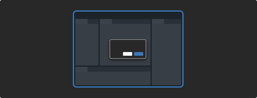
A window using popup-style framing:
- Window position is set by the control that triggers it
- Window closes when clicked outside the frame
- Does not have a title bar, and cannot be dragged
- Cannot be minimized or maximized
- Cannot be resized
A window using popup-style framing:
- Window position can be set manually or determined by the cursor
- Window does not close when clicked outside the frame
- Does not have a title bar, and cannot be dragged
- Cannot be minimized or maximized
- Cannot be resized
A single instance auxiliary window:
- Window can only have one instance
- Window position can be set by the control that triggers it
- Window closes when clicked outside the frame
- Can be dragged by the title bar
- Cannot be minimized / maximized
- Cannot be resized
A persistent modal window:
- Always on top and does not allow background interaction
- Window position can be set manually or determined by the cursor
- Window does not close when clicked outside the frame
- Can be dragged with the title bar
- Cannot be minimized / maximized
- Cannot be resized
A persistent modal window:
- Always on top but allows background interaction
- Window position can be set manually or determined by the cursor
- Window does not close when clicked outside the frame
- Can be dragged with the title bar
- Cannot be minimized / maximized
- Cannot be resized
Dialogs are modal windows rendered by the operating system:
- Dialogs are messages that present a short-term task the user must perform to continue the operation
- Users will not be able to interact with the Editor until the dialog is closed
Window types
Default window


A default window with a tab and docking area with a window menu.
This window can be docked in tab docks to customize the environment and discreetly stack windows and panels contextually.
When released anywhere on the Editor, it will undock as a modal with a title bar and OS window controls.
- Can be docked in tab docks
- Can be dragged with the title bar
- Can be minimized / maximized
- Can be resized by dragging corners
Dropdown window


The window is styled in the same way as a PopupWindow. This means the window is automatically closed when it loses focus and the window has no frame around the edge.
Note this function auto-fits the window to the screen while trying to place it first below then above the button it was triggered from. This means the windowSize might change when fitting it to the screen, so make sure to read the 'position' afterward to check whether the size was cropped.
- Window position is set by the control that triggers it
- Window closes when clicked outside the frame
- Does not have a title bar, and cannot be dragged
- Cannot be minimized or maximized
- Cannot be resized
Popup window


Shows an Editor window using popup-style framing. This means the window has no frame, and is not draggable. It is intended for showing something like a popup menu within an existing window.
- Window position can be set manually or determined by the cursor
- Window doesn't close when clicked outside the frame
- Does not have a title bar, and cannot be dragged
- Cannot be minimized or maximized
- Cannot be resized
Auxiliary window


The single auxiliary window can be re-used by different editor windows at different times. Showing an editor window in the auxiliary window can be useful to avoid clutter of many small windows.
- Window can only have one instance
- Window position can be set by the control that triggers it
- Window closes when clicked outside the frame
- Can be dragged with the title bar
- Cannot be minimized / maximized
- Cannot be resized
Modal window


A persistent modal window. Other windows will not be accessible and any script recompilation will not happen until this window is closed.
- Always on top and does not allow background interaction
- Window position can be set manually or determined by the cursor
- Window does not close when clicked outside the frame
- Can be dragged with the title bar
- Cannot be minimized / maximized
- Cannot be resized
Utility window


When the utility window loses focus it remains on top of the new active window. This means the utility window is never hidden by the Unity Editor. It will be hidden when the user switches from Unity to another application.
- Always on top but allows background interaction
- Window position can be set manually or determined by the cursor
- Window does not close when clicked outside the frame
- Can be dragged with the title bar
- Cannot be minimized / maximized
- Cannot be resized
Dialog window
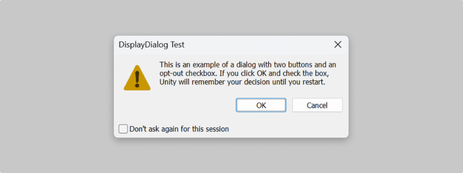
Dialogs are messages that present a short-term task the user must perform to continue the operation. Users won't be able to interact with the Editor until the dialog is closed.
- Dialogs should be reserved to be used when a response is required, such as critical messages, interruptive actions or destructive outcomes, eg. saving the project before quitting
- Dialogs should have an opt-out from displaying option if they might be shown repeatedly
There are 2 main type of dialogs: OS naitve and Unity native (as opposed to completely custom dialogs)
- Unity Editor uses the operating system dialog by default
- Unity native dialogs should be used only if there are specific needs that can't be done with basic OS dialogs.
For information on how to display Editor notifications and messaging go to Patterns > Error and messaging ->
Note that Editor API will automatically display the operating systems default button order. For more info, go to Button > Button order ->
Window anatomy
Window tab and docking area

Default windows in the Editor are instantiated with a window tab, that can contain the name and the icon of the view, and a docking area where multiple tabs can be docked.
- Tabs organize related windows or content in the Editor by allowing a unique visual location in the interface
- They function by helping to create a structure for condensing visual elements like windows and controls into a nested and navigable pattern
- Tabs simplify the visual real estate of the workspace while improving organization and workflows
Script Reference
Tab label
Tab labels contain the name of their window. These are meant to indicate the window’s purpose whether it is displayed or grouped behind other tabs. Tab labels should not be displayed vertically.
Icons in tab labels
Tab icons should follow the standard Iconography guidelines. Icons should be simple intelligible glyphs relating to the tab contents. Icons should be placed to the left of the label with a 4px margin.
Tab container
Tab container holds the tab label and icon (if applicable). The container is the area in which a tab’s context menu can be accessed. The tab container also holds the tab’s indicator which shows if the tab is being focused on.
Tab border
Tabs have borders based on their order in the docking area. While regular tabs .dragtab have borders on both sides, a tab docked in the first position .dragtab-first only has a right border.
Docking area
The space within a panel that tabs inhabit is the docking area. Although this is technically part of a panel it has an important effect on tab behavior and anatomy; it represents the area in which tabs can inhabit and where other tabs will be grouped when placed in the same panel.
Docking area acts as a container for tab labels, allowing for the placement of tab navigation elements and panel UI. As a result it is persistent even if there are no other tabs in the panel to convey the grouping functionality.
Dock anchor menu / window menu
A temporary pop up menu that displays a list of options, triggered by a button or label that invites the user to select preferences.
Use an anchored menu when the items do not need to be visible unless being changed. If you need items to persist and be visible (for example for debugging or settings changes), use a radio button group in the UI or use a default or utility window.
Window frame and body

A Unity Editor window body displays Editor content and allows user to interact with its contents. When floating, a Unity window is framed by the operating systems window element and a title bar.
It often consists of:
- Tab and dock
- Toolbars
- Panels
- Title bar (pictured in macOS 12)
- Window frame (pictured in macOS 12)
Resizing
A window frame can be resized by using any of the sides or corners. The OS will switch the mouse pointer to display the direction it can be resized.


If the window has a split-view panel, the mouse pointer will become a double-sided arrow with a separator between the arrows, letting the user know the panel can be resized.


Ideally, views should avoid any design that necessitates both vertical and horizontal scrollbars.
This can be done using:
While it’s best to avoid having both vertical and horizontal scrollbars, they should not be completely removed, as doing so would prevent users from accessing all parts of a view without resizing it.
Setting maximum and minimum sizes
Most editor windows can be resized whether they are docked or floating. maxSize and minSize variables are used to provide the largest and smallest width and height that is supported.
Scripting API
Window states

Create a custom Editor window
Custom Editor windows allow you to extend Unity by implementing your own editors and workflows.
Follow the guidance below that covers:
- Creating an Editor window through code
- Reacting to user input
- Making the UI resizable
- Handling hot-reloading
Resources


