

Overview

- Labels are used for identifying input controls in an interface
- In addition, bold labels can be used to nest elements in an interface
- Adjustment based controls that require fine input can be interacted with their label
- When hovered, labels can display tooltips with useful information about the control, ensuring the user has proper information about its function
Label APIs
Labels in UI Toolkit
API in UI Toolkit
API in IMGUI
Guidance
When to use
Common use cases for labels are;
- Text that identifies an action or a control; most controls in the Editor should display a control label in front them
- Tree view and list view items
- Inspector headers that group other elements
- Foldouts, tabs and many other controls also have labels
Icons and labels/names
All icons should be assigned a label/name.
Pairing with icons

Common use of labels with icons are:
- Inspector component headers
- Tabs
- Tree or list view items
Content best practices
- Labels do not end with punctuation such as colons, full stops, or question marks
- Menu and button labels that perform actions should be verbs or verb phrases that describe the action being performed
- Labels shouldn't be longer than three words
Adding tooltips
Labels can be paired with tooltips to display useful information about the control, ensuring the user has proper information about its function. Use tooltip property to display tooltips.
Properties
Formatting
Alignment

Left-aligned
Text in the Editor is left-aligned in windows, dialogs and components including tabs, dropdowns, and menus.
Centre-aligned
The exception to this rule are:
- Button labels, which are centred within their containers
- Empty state content
Label styles

Regular labels
Tree view list items, and labels that identify an action or a control use regular text weight:
Bold labels
Labels can be styled bold when used to group other items, or an active links.
- Nesting headers
- Inspector component headers
- Nesting foldout labels
- Main tree view folder labels
Focused labels
When focused, labels are highlighted blue, like most other Editor controls in focused states.
Labels with semantic colors
Semantic colors are used in text to convey conventional meanings and convey the same meaning in all contexts.
- Blue link labels are used for external links, and are reserved for directing users out of the editor. Do not use them to open editor native windows.
- Red and orange are reserved for error and warning messages. Read more on errors and messaging
See all label color variables ->
Interactive labels
Adjustment based control elements that require fine input, or enable / disable toggles when used alone, can be interacted with their label. This gives users a wider area and finer control to interact with these elements:
- Sliders value can also be adjusted through its label by hovering and dragging the cursor left or right. The cursor switches its glyph when positioned over the label to communicate this ability.
- Numeric field values can be adjusted the same way as sliders
- Toggles when used alone, can be toggled ON or OFF via clicking on their label
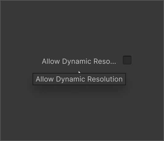
Truncated labels
When the UI is resized or on smaller screen sizes, text may be cut off.
- Labels that can't be displayed entirely should be truncated and displayed with an ellipsis (...).
- Use end truncation for regular, sentence-like labels.
- Use middle truncation for objects, stylesheets, or other labels where seeing the end is important.
- Use tooltips to allow the user to access the full string without resizing their UI.
All text variables
Default text colors

Windows and component text colors

Toolbar text colors

Code samples
Code references
Scripting references for
UI Toolkit
Provides an Element displaying text.
Scripting references for
IMGUI
Provides an Element displaying text.
Resources and related


