

Overview

Unity Editor includes these message expression types:
Errors and other types of alerts are used to communicate conditions, indicate an event, or show responses to user actions. They can be expressed with dialogs (pop-up modals), window banners,
help boxes, or console and status logs.
- Messages are alerts that identify problems, suggest fixes, and provide information to the user
- Most messages comes in three varieties: Error messages, warning messages, and informative messages (log messages)
- Message contents are usually composed of three parts: the problem, the cause, and the solution
- Message language should always be polite, precise, and constructive
- For errors and warnings, provide a likely workaround solution that the user can use to fix the issue
Message types
Error messages

- Indicates a function will not complete an action
- Use errors for situations where Unity can not recover or proceed normally
- Error messages in the console are themed red
Warning messages

- Indicates a function that will complete an action but may return results that are not what the user intended
- Use warnings for situations where Unity can recover/proceed, but users may be unaware of the side effects
- Warning messages in the console are themed yellow
Informational (log) messages

- Used for communicating non-critical information
- Can provide helpful advice that is not essential to the operation
- Shares similarities to Tooltips
- Sometimes referred to as a log message
Message theming
Color use

Feedback icon colors
Status message text colors
Help box colors
Icon use

Error icon: Represented by a red octagonal warning icon with an exclamation mark
Warning icon: Represented by a yellow triangle warning icon with an exclamation mark
Info (log) icon: Represented by a white speech bubble icon with an exclamation mark
Content best practices
Content overview
Well written alert messages should be:
Human-readable
Messages should use the plainest possible language that can clearly convey the message. Avoid obscure codes, abbreviations, and technical jargon. Ideally, a beginner-level user of the feature should be able to understand the alert message.
Concise
Only include the information the user needs to understand and resolve the immediate problem.
Polite
Alert messages should not be written in a negative voice that blames users for incorrect usage but in a positive or neutral voice. Avoid phrases like "illegal command".
Problem / cause / solution
All error and warning messages relating to a specific problem should include these three key elements, in this order:
The problem
Ensure the problem is clearly identified in plain language.
The cause
Where possible include the cause of the problem so that the message not only helps correct this particular instance of a problem, but becomes a teachable moment that helps prevent future mistakes.
The solution
Recommend constructive advice on how to fix the problem.
Message content
Do include any phrasing that specifically relates to that error so users can look up that exact problem on a search engine using precise wording.
Don't use vague wording such as "syntax error".
Don't begin the error or warning message with “Error” or “Warning” as the color styling and associated icon makes this wording redundant.
Examples
Cause: Because it cannot load the textures.
Solution: Refresh the textures and re-launch the application.
Cause: Because the shader in your build is not compatible with the VGPR ABI requirements of one or more of the used instance shaders.
Solution: To reduce performance impact, use "#pragma platform_call_register_window <n>" in the ray generation shader instead.
Cause: File names can only contain alphanumeric characters.
Solution: Please enter an alphanumeric file name.
Expression types
Dialogs (pop up modals)
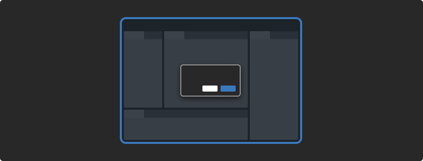
Dialogs are messages that present a short-term task the user must perform to continue the operation. Users will not be able to interact with the Editor until the dialog is closed.
- Alternatively referred to as pop-up modals
- The Editor displays the operating system dialog by default
- Dialogs are invasive and should be used sparingly
- Dialogs should only be used when a response is required, such as critical messages, interruptive actions or destructive outcomes, eg. saving the project before quitting
- Dialogs can have one, two, or three buttons. Dialogs with only the ok button should only be used for displaying a specific user decision, or acknowledgement
- Avoid complex options that require information unavailable in the dialog
- Option labels should be a verb, or verb phrase, to indicate the action undertaken when the button is clicked
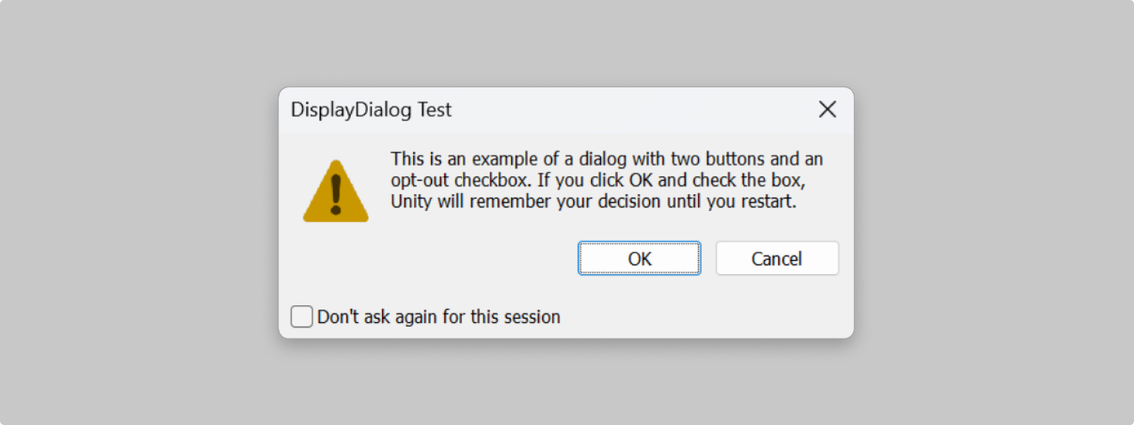
- Dialogs should have an opt-out from displaying option if they are likely to be shown repeatedly
Operating system native dialogs

Scripting API
Dialog
Do not show again
For dialog boxes that might be shown repeatedly, consider using an overload of this method that takes a DialogOptOutDecisionType
There are two opt-out options:
- Don’t ask again for this session:
- Recommended for messages that are relevant for the current task but not necessarily for future tasks in a different project (e.g. deleting large groups of assets)
- Recommended for messages that might be useful in a specific workflow but not universally
- Don’t ask again for this computer:
- Recommended for situations where advanced users would likely always prefer that action knowing the possible undesired side effects (e.g. upgrade options that occur during import)
* Note that users can reset these opt-outs in the EditorPrefs
Scripting API
OptOut
OptOut
DialogWithOptOut
Dialog Message Types
The three message types are available to use on the operating system native dialogs. The dialog will display the corresponding icons:
Error: For situations where Unity can not recover or proceed normally
Warning: For situations where Unity can recover/proceed, but users may be unaware of the side effects
Info: For communicating non-critical information
Button order in OS native dialogs
Editor displays the native operating system dialog
- On macOS 12, button order is ok / alt / cancel
- On macOS 11, button order is alt / cancel / ok
- On Windows, button order is ok / alt / cancel
Button order in the Editor native dialogs

In the Editor, destructive buttons are aligned on the left, and secondary / primary buttons are aligned on the right hand side of the panel they are displayed in.
Button actions
- Dialogs can have ok, cancel and alt buttons
- The ok button is the default option, and can also be activated by pressing Enter
- The cancel button is considered the "cancel" action and should usually not perform any action besides closing the dialog. The X button or escape key are also considered as "cancel" actions.
- The cancel option is not set by default. If not set, only the ok button is displayed.
If the dialog uses the Opt-out option:
- "Cancel" option is never remembered
- ok and alt options are remembered
Window banners


Window banners are used to provide brief feedback about an operation that affects the entire active window. They are used for informative purposes and are not persistent on the screen.
Window banners are rendered via the function EditorWindow.ShowNotification in the affected interface.
- Window banners automatically fade-out after some time. (Default duration is 4 seconds)
- Window banner size is responsive to the window size
- Window banners are displayed in the lower half of the window
- Avoid using window banners to describe edge cases
Message duration
- Default message duration is 4 seconds
- Use fadeoutWait parameter to adjust the duration the notification is displayed. Measured in seconds
- Duration should be based on the length of message content
Section messages (help boxes)


Section messages (help boxes) are used to alert the user of something that happened in a specific section of an Editor window, such as a property setting.
They appear as help boxes in the affected interface.
- They appear below the affected area (for example a property in the Inspector window)
- Help boxes shift the content below it
- Avoid using Help Boxes to describe edge cases
- Avoid using Help Boxes for documentation
API in
UI Toolkit
API in
IMGUI
Console and status logs


Console messages are important messages that help users with debugging the application / issue and to log important messages in the console.
- Are easily understood
- Are informative on what happened or caused the message to appear
- Contain identifying information in the message
- Debug.Log is used to log messages to the Unity Console
- Debug.LogWarning is used to warning messages to the Unity Console
- Debug.LogError is used to error messages to the Unity Console
Console logs
- Console window uses toolbar toggles to hide / show different message types for easier tracking / resolving
- Time stamps are added automatically / on time the message is first logged
- You can format messages with string concatenation Debug.Log("Text: " + myText.text);
- You can also use Rich Text markup
- Call stack information should be given in the message for easier debugging
Status messages
- Latest console message is displayed in the bottom of the editor in a single line as a status message, and when clicked it opens the Console window
Assigning an object
Use context parameter to set the object which the message applies to.
If you pass a GameObject or Component as the optional context argument, the object will highlight in the Hierarchy window when you click the log message in the Console.
Which type to use
Scale and location
- If the message prevents the user from continuing until a choice or an action is made, use dialogs
- If the message is a confirmation or an acknowledgment that requires minimal user interaction, use a window banner
- If the message is about a property or a control in the window, use a help box
- If the message is operational to the Editor, it should be logged as a console log
Severity: Is it critical? Does it disrupt the user flow?
- If the message presents a short-term task the user must perform to continue the operation, use dialogs
- If the message is not critical, use an info (log) message type
- If the message is critical, use error or warning messages types based on the severity of the issue
Layout
- When working in high-density layouts, do not disrupt the vertical layout of the interface
- Help boxes are displayed after its related controls / layout
- Help boxes shift the content below it
- Use window banners to give informative messages about the active window
Persistence
- If the message relates to a task that the user needs to perform, use a dialog
- If the message needs to appear to inform the user of a non-disruptive event or give brief feedback, use window banners that disappear overtime
- If the message needs to stay visible until it is resolved, and relates to a specific section or control, use a help box
- Persistent messages need to be logged in the console if they affect larger operations

