

Overview
Accessibility improvements involve any inclusive design and implementation practices that enable people of all abilities to more easily use the Unity Editor. While the primary accessibility audience is the disabled community, any accessibility improvements to the Unity Editor will improve usability and quality for all users.
Color
Users rely on color to identify, process, and organize content.
Semantic color
Semantic colors have universally consistent meanings independent of cultural contexts.
Use semantic colors to indicate value states in a way that follows the standard meaning.
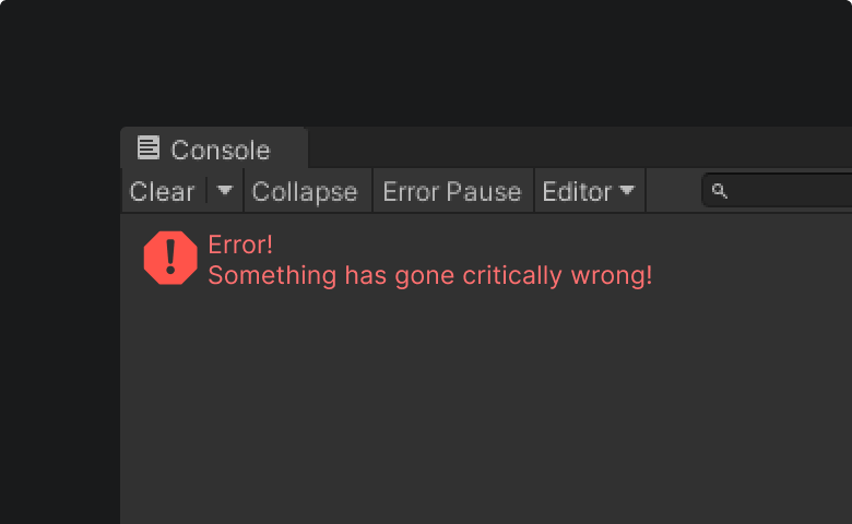
Red = Error, Failure, Wrong
Red is used as visual confirmation to indicate errors or other negative conflicts within an interface or process.

Green = Confirm, Success, Correct, Safe
Green is used as visual confirmation to indicate the success of a process.
Yellow = Alert, Caution, Warning
Yellow is used as visual confirmation to indicate an alert, caution, or warning.
Color usage
- The usage of color should support the user interface and improve comprehension and legibility.
- Color should not be used solely for decorative purposes.
- Color should never be used as the sole differentiator in indicating an element.


Color blindness
Users who are colorblind may have a hard time identifying differences in an element’s color.
Color blindness is a very common disability: 1 out of every 12 men and 1 out of every 20 women experience color blindness.
Follow color contrast guidelines and avoid using color as the sole differentiator when possible.
This will enable a high percentage of users to comprehend information in the Unity Editor.

Contrast
Contrast for low vision
The majority of people who experience challenges viewing computer screens are not blind or color blind but are considered to have what is referred to as “Low Vision”. Low vision affects at least 2.2 billion people worldwide.
Low vision is often misattributed to aging. While many of the diseases that can cause low vision are more common in the older population, aging alone does not cause of low vision.
Contrast ratios
Having sufficient color contrast between text and its background is crucial for users with low vision.
The lowest acceptable contrast ratio as set by the WCAG 2.1 is as follows:
- 4.5:1 for normal text WCAG 1.4.3 Contrast
- 3.0:1 for non-text content like form controls and icons WCAG 1.4.11 Non-text contrast
Contrast ratios can be easily measured with free contrast checking applications.


How to test text contrast
Do not color-pick text as it may provide inaccurate results due to font rendering. Instead, use the hex-value of the text and assess its contrast against the background color.
Certain uses of text have no contrast requirements, such as:
- Text or images of text that are part of an inactive user interface component
- Text that is purely decorative
- Text that is not visible
- Text that is part of a picture that contains significant other visual content
Color variables for the Editor
The color variable system housed within the Unity Style Sheet (USS) files will automatically meet these criteria and should be used whenever possible. This system will ensure compliance of both contrast and usage consistency.
Legibility
It’s important that text and interactive elements can be seen and quickly understood. Users should be able to understand the function of interactive text within the context of the surrounding UI elements at a glance.
Background opacity
When the background of a window or area has opacity, the foreground text should be readable and meet the minimum contrast requirements.
Consider all possible background colors that can occur behind text elements and ensure that any foreground text element color meets the minimum contrast requirement for the background color.


Disabled text
- Text that is part of a disabled element (i.e. a disabled button) should meet minimum contrast requirements if text is grayed out to show an element is no longer available for use.
- Disabled elements should not be interactive to the user.
- If a grayed out area is interactive, consider another visual method to communicate what is happening.


Font size
The Editor features a limited range of font sizing on elements and in menus. As the Editor is a dense desktop software application, limiting the number of font and styling options keeps the interface cohesive and well-defined.
- Minimum size: Fonts as small as 9px can be used but only when absolutely necessary. Small fonts reduce accessibility and readability for many users.
- Base size: Use the standard font size 12px for most text when using the Inter font family.
Icon size
Icon sizing should follow the guidelines detailed on the Iconography page.
Focus styling
Items in-focus should be clear and visible in an Editor environment that may have many panels, buttons, and objects competing for attention.
- The focus state should be distinct from the hover state
- In-focus elements need at least 3:1 contrast with the background color in order to be legible, as noted in WCAG 2.4.11
- Indicate focus with a 1 px blue outline surrounding the focused field or control
- List items that are currently selected show focus with a blue highlight and white text
- Labels associated with the field in focus are also blue
- Show other focused elements with a blue 1 px box around the greater element area when no input boundary is clear


Click-Target size
An element’s click-target is the total area that a user is able to click to invoke its action. Click-targets can be greater than the space visibly represented to help compensate for controls, helping users interact with ease while also preventing accidental activation of unwanted actions.
The recommended minimum click-target size as noted in WCAG 2.5.5 is 44 x 44 px, translating to around 9mm (square) on a laptop with a 120 dpi screen. In situations where the recommended minimum click-target size cannot be met for an element, the biggest click-target possible should be created by using the space behind an element (such as an icon) as part of the target space. If this is not possible, the functionality needs to be available through an equivalent control in the same area that does meet the minimum size.


Keyboarding
In the context of accessibility, the term “keyboarding” refers to the ability to navigate a user interface entirely by keyboard. It should be possible to access all areas of the user interface through keyboarding without the need for special knowledge of shortcuts or hotkeys.
Do:
- Ensure all elements are accessible via keyboard.
- Ensure there is a full list of hotkeys available for users who want to perform more advanced tasks only using the keyboard.
- Ensure focus navigation happens in a logical order.
Don't:
- Do not allow areas of the user interface to be unreachable via the keyboard.
- Do not allow "keyboard traps" in the product where the tab order disappears or gets “stuck” and leaves users unable to move on to another focused element.
Common keyboard shortcuts:
- Tab Should move the user through the interface from top left to bottom right in a logical, predictable order; a proper indication should highlight the element in focus
- Shift + Tab Should reverse the direction of tabbing in the same logical order
- Ctrl + Tab Should move the user to the first open tab in each window group
- Spacebar Should expand dropdown menus, activate a button, check/uncheck a checkbox, or perform “click and hold”; in a page, the spacebar should scroll down a screen at a time
- Shift + Spacebar In a list, should scroll up a screen at a time
- Arrow keys should cycle through dropdown content; in a page, arrow keys should scroll in four directions
- Esc should delete or revert an input (such as numeric fields or search input), or dismiss a dialog / menu.
- Enter or Return should activate a link or a button, or select an autocomplete option
Writing and alt text
Include image alt text and descriptions
Alt text means “alternate text” and is a means of assigning a textual description for images or visual elements. The purpose of alt text is to describe an item to a user who may not be able to clearly see the item or give clarity to an unfamiliar visual element.
As perceiving images is particularly problematic for visually impaired people, it is vital to include both alt text and image descriptions. Some users with cognitive impairments find text easier to interpret than images, while users with low vision often turn off images and instead depend on alt text, which scales better than images.
- Similar to tooltips, alt text can appear while hovering over an element. However, alt text should be restricted to descriptive information and not include calls to action or instructions. Meanwhile, tooltips have more room to display in-depth information and helpful details than alt text.
- For every image, icon, or graphic, write alt text that briefly describes the basic essential details or function of the image. The alt text is usually concealed behind the image.
- Do not use images that contain text.
- Do not start alt text with “Picture of…” or “Image of…”
- Words that are cut-off should be supported by clear alt text
- Avoid using partial words when trying to fit text into the UI
Text should support the interaction
Text should be mapped to the user action, clearly indicating the action which will be performed.
Text on elements like toggle fields should match their interaction: Toggles should have their ticked state referred to as “enabled” and contain phrasing and functionality that reflects that state.
Do: Write text that is visually and logically aligned inline with the UI interaction
Don’t: Write text that makes it unclear what the UI interaction is enabling or disabling
Make link text descriptive
- Use meaningful text to describe the content of the link target so it makes sense when read out of context.
- Examples of link text to avoid: "Click Here" or "Read This Document"
- Don't use the link URL as the link text.
- Use the same text for links to the identical destination page. Use unique text for links to different destination pages.
Italics
Italics can be difficult to see and read even at larger font sizes for those with low vision. Italic text should be limited to one or two words if absolutely needed or avoided when possible.
Tooltips
Tooltips are messages that appear on prolonged hover over an element. They can include helpful descriptions of what the element is for and clarification for different states and options. Tooltips can be tricky in terms of accessibility so it is best to follow the following basic rules to ensure good usability.
Tooltips should:
- Appear directly next to an element
- Appear after a prolonged hover or focus on an element.
- Have a default duration for 1.5 seconds
- Remain on during tooltip hover
- Disappear quickly on hover away
- Be concise; long tooltips are not readable or usable
- Have good contrast between the foreground text and the background color
- Avoid transparent backgrounds
Loaders
- Is there associated progress data? Use a progress indicator that shows the time or percentage of completion.
- Is there no associated progress data? Use a standard circle loader to depict infinite loading.
- Does the process lack progress data? Avoid using a progress indicator or a visual design similar to a progress indicator for an infinite load with no associated progress data. Improperly using progress indicators creates special difficulties for those people with cognitive disabilities while generally causing frustration and annoyance for all users.
Loading animations are frequently used whenever a user has requested an action that will take an extended period of time. There are accessibility challenges to consider when choosing what type of loader to use. If they are built incorrectly they can create confusion and frustration for users.
It’s important to use the correct animation for the job.
Testing for usability
There are some basic accessibility considerations to check for when implementing UI and features in the Editor. Below is a basic checklist of basic things to consider and address while building features as well as during the QA process.
Checklist
Check colors (semantic).
- Color should never be the sole differentiator on elements
Alt text should be available on all visual elements
- Alt text should not include lead-ins like “an image of”
- Graphics should not contain text if text can be written elsewhere
In-Editor copy (UX Copy) should be clear and concise
- Tooltips should be contextual, concise, and actionable.
Everything should be accessible via keyboarding
- Tab order should follow a standard flow
- Tab order should cycle
- Shortcuts should be made for common actions
- Ensure there are no keyboard traps or areas where the keyboard focus is “stuck”
Text should be clear
- Text should always be legible
- There should be no flashing or blinking text
- In-Editor copy should be clear, contextual, and concise.
Special Features and Accessibility Options should be documented
Presently these guidelines are not a full list of every accessibility requirement.
Please visit the WGAC 2.1 for a comprehensive list.
A quick reference guide is also available.
Globalization, Internationalization and Localization

- Globalization refers to the broader processes by which a company brings its business to the rest of the world.
- Internationalization is the specific practices of designing products, services and internal operations to facilitate expansion into international markets.
- Localization is the adaptation of a particular product or service to one of those markets.
Internationalization and localization must be considered when a product is expanding to multiple national or even regional markets. Planning for these processes before a project begins improves the design of products that satisfy users of all regions, cultures, and languages and helps prevent cascading problems after the product has moved beyond the design phase.
It is important to consider responsive UI and localization text size changes. Some languages use more words than others to convey the same message and therefore the localization process must account for text expansion and contraction in translated languages.
The Unity Editor is available in such languages as English, Simplified Chinese, and Korean.
Language packs can be installed during the Unity install process in the Hub.
Accessibility resources and tools
Familiarize yourself with accessibility specific tools and resources to ensure an accessible experience.
General
Digital accessibility is often defined specifically for web based applications. However these resources can also be utilized for all software applications.
Color blindness testing
Below tools allow you to view your designs in different types of color vision deficiencies.
- Figma plugin — Color Blind
Color Blind allows you to view your designs in the 8 different types of color vision deficiencies. - macOS plugin — Sim Daltonism
Sim Daltonism lets you visualize colors as they are perceived with various types of color blindness.
Gaming
When creating tooling for users to make in-game experiences these resources can provide specific guidance.
Unity internal

